Component library
Component library provides an easy way to construct your application UI.
Built-in components
In order to access a list of built in components hover over Component library
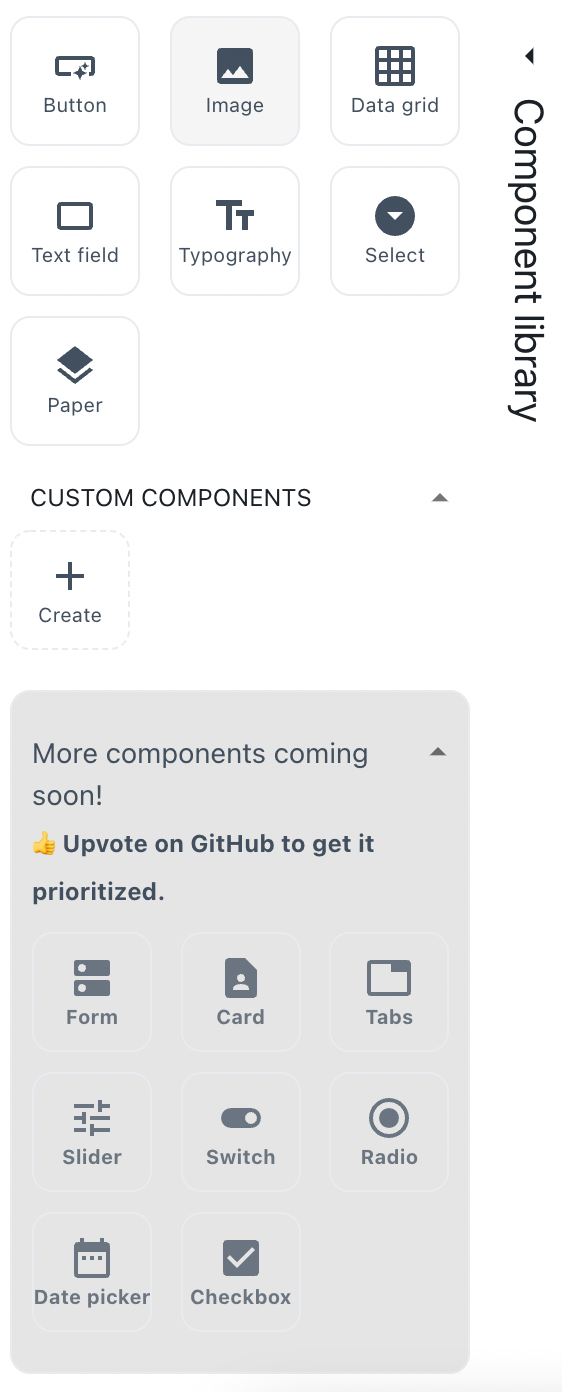
Currently supported components:
- Button - capture user actions.
- Image - display different types of images.
- DataGrid - use our premium data grid component and easily render various types of tabular data.
- TextField - capture textual user input.
- Typography - present your textual content.
- Select - capture user input from a list of options.
- Paper - provide a visual differantation for your components
We are working hard to add even more components. To make it easier for us to understand what should be added first, please help by upvoting