MUI Core
Ready to use components,
free forever
Get a growing list of React components, ready-to-use, free forever, and with accessibility always in mind. We've built the foundational UI blocks for your design system so you don't have to.

The world's best product teams trust MUI to deliver an unrivaled experience for both developers and users.
Component library
40+ building block components
We've built the foundational components for your design system, enabling you to launch that cool product you've been thinking about even faster. We got your back!
<div>
  <Button variant="text" startIcon={<ShoppingCartRounded />}>
    Add to Cart
  </Button>
  <Button variant="contained" startIcon={<ShoppingCartRounded />}>
    Add to Cart
  </Button>
  <Button variant="outlined" startIcon={<ShoppingCartRounded />}>
    Add to Cart
  </Button>
</div>Own the styling!
Build your own design system using the sophisticated theming features. You can also start by using Google's Material Design.
Theming
Build your design system just as you want it to be
Use the advanced theming feature to easily tailor the components to your needs. You can also quickly start with Material Design.
Ultraviolet
<Card
variant="outlined"
sx={{
p: 1,
display: 'flex',
flexDirection: { xs: 'column', sm: 'row' },
}}
>
<CardMedia
component="img"
width="124"
height="124"
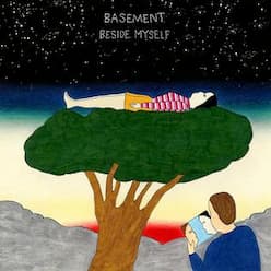
alt="Beside Myself album cover"
src="/static/images/cards/basement-beside-myself.jpeg"
sx={{
borderRadius: 0.5,
width: 'clamp(124px, (304px - 100%) * 999 , 100%)',
}}
/>
<Box sx={{ alignSelf: 'center', px: { xs: 0, sm: 2 } }}>
<Typography
variant="body1"
color="text.primary"
fontWeight={600}
sx={{
textAlign: { xs: 'center', sm: 'start' },
mt: { xs: 1.5, sm: 0 },
}}
>
Ultraviolet
</Typography>
<Typography
component="div"
variant="caption"
color="text.secondary"
fontWeight={500}
sx={{ textAlign: { xm: 'center', sm: 'start' } }}
>
Basement • Beside Myself
</Typography>
<Stack
direction="row"
spacing={1}
sx={{
mt: 2,
justifyContent: { xs: 'space-between', sm: 'flex-start' },
}}
>
<IconButton aria-label="fast rewind" disabled>
<FastRewindRounded />
</IconButton>
<IconButton
aria-label={paused ? 'play' : 'pause'}
sx={{ mx: 1 }}
onClick={() => setPaused((val) => !val)}
>
{paused ? <PlayArrowRounded /> : <PauseRounded />}
</IconButton>
<IconButton aria-label="fast forward" disabled>
<FastForwardRounded />
</IconButton>
</Stack>
</Box>
</Card>Styling
Rapidly add and tweak any styles using CSS utilities
CSS utilities allow you to move faster and make for a smooth developer experience when styling any component.
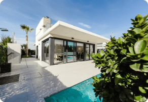
123 Main St, Phoenix, AZ
<Card
  variant="outlined"
  sx={{
    display: 'flex',
    p: 1,
    flexDirection: {
      xs: 'column', // mobile
      sm: 'row', // tablet and up
    },
  }}
>
  <CardMedia
    component="img"
    width="100"
    height="100"
    alt="123 Main St, Phoenix, AZ cover"
    src="/static/images/cards/real-estate.png"
    sx={{
      borderRadius: 0.5,
      width: { xs: '100%', sm: 100 },
      mr: { sm: 1.5 },
      mb: { xs: 1.5, sm: 0 },
    }}
  />
  <Box sx={{ alignSelf: 'center', ml: 2 }}>
    <Typography variant="body2" color="text.secondary">
      123 Main St, Phoenix, AZ
    </Typography>
    <Typography component="div" fontWeight="bold">
      $280k - $310k
    </Typography>
    <Box
      sx={{
        ml: -1,
        mt: 0.75,
        px: 1,
        py: 0.5,
        borderRadius: 1,
        display: 'flex',
        typography: 'caption',
        bgcolor: (theme) =>
          theme.palette.mode === 'dark' ? 'primary.900' : 'primary.50',
        color: (theme) =>
          theme.palette.mode === 'dark' ? '#fff' : 'primary.700',
      }}
    >
      <InfoRounded sx={{ fontSize: 16, mr: 0.5, mt: '1px' }} />
      Confidence score of 85%
    </Box>
  </Box>
</Card>
Community
Get and give help by joining our contributors community
The core components were crafted by many hands, all over the world. Join the community to help us expand it even further!
Learn moreWeekly downloads on npm
Stars on GitHub
Open-source contributors
Followers on Twitter